Envisioning Information
It's much easier to read large collections of data in a visual format and this type of graphic data presentation is a modern phenomenon (relatively speaking). Can you imagine reading all these data points as lists of numbers? Talk about information overload . . . but like all other information you receive visually, everything is done for a reason.
 Read the above data points. What has been the trend for winter temperatures in England for the last 350 years? What projections can you make from this trend?
Here's another graph of 10,000 years of global temperatures from the Greenland Ice Sheet Project 2.

What has been the trend for worldwide temperatures in the last 10,000 years? What projections can you make from this trend?
Here's a different presentation of the same information:

Why do you think the author highlighted certain segments of the data line? The green bars are labelled using periods of human civilization: Minoan warm period, Roman warm period, Medieval warm period, Modern warm period. Why do you suppose the author chose to use civilization labels? Why do you suppose the creator chose to use green shading rather than blue or orange shading?
What does the red line represent, and why is it red?
Why did this creator editorialize the information? In other words, why did he add different colors and labels to his presentation? Does this data confirm what you think about global temperatures? Why or why not? What predictions can you make about global temperature trends based on this data?
Should we make predictions on global temperatures based on any of these graphs? Why or why not?

Here's another graph of 10,000 years of global temperatures from the Greenland Ice Sheet Project 2.
What has been the trend for worldwide temperatures in the last 10,000 years? What projections can you make from this trend?
Here's a different presentation of the same information:
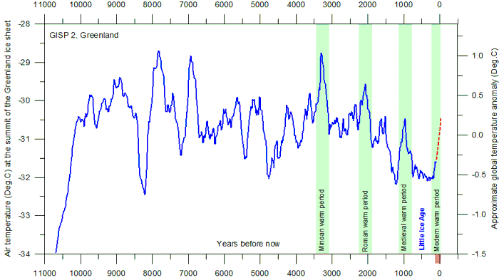
Why do you think the author highlighted certain segments of the data line? The green bars are labelled using periods of human civilization: Minoan warm period, Roman warm period, Medieval warm period, Modern warm period. Why do you suppose the author chose to use civilization labels? Why do you suppose the creator chose to use green shading rather than blue or orange shading?
What does the red line represent, and why is it red?
Why did this creator editorialize the information? In other words, why did he add different colors and labels to his presentation? Does this data confirm what you think about global temperatures? Why or why not? What predictions can you make about global temperature trends based on this data?
Should we make predictions on global temperatures based on any of these graphs? Why or why not?


The last picture shows the temperature on the summit of the Greenland Ice sheet for the last 10000 years. According to the picture, global warming is not unusual for the Earth, so nowadays, the panic about global warming doesn’t have any ground. It shows that there were a lot of periods when the temperature was higher than now. Moreover, this graph proves that global warming can’t be explained by human being influence only. Contrary, it is natural process that is probably independent from humans. However, we can’t make conclusions based on this particular graph only because the data were taken from one particular point on the Earth that doesn’t reflect the global temperature trend.
ReplyDelete