A Different Kind of Syllabus . . .
that I wish I could do, but I can't because my best drawing involves stick figures.
 Lynda Barry, author of 100! Demons is teaching a course called the "Unthinkable Mind" at the University of Wisconsin during the Spring 2013 semester. Keep in mind this is not a graphic novel, comic, or "how to" art class, it is a class about how the different parts of our brain function. According to Open Culture Barry wants to appeal to both Humanities and Science majors by creating
Look at the first page of Barry's syllabus posted above, and other than drawings, how does it compare to the normal ten-page, single spaced, typewritten syllabus your professor usually hands out? Do you think pictures help students better understand what is expected of them? Would you like to get a syllabus like this?
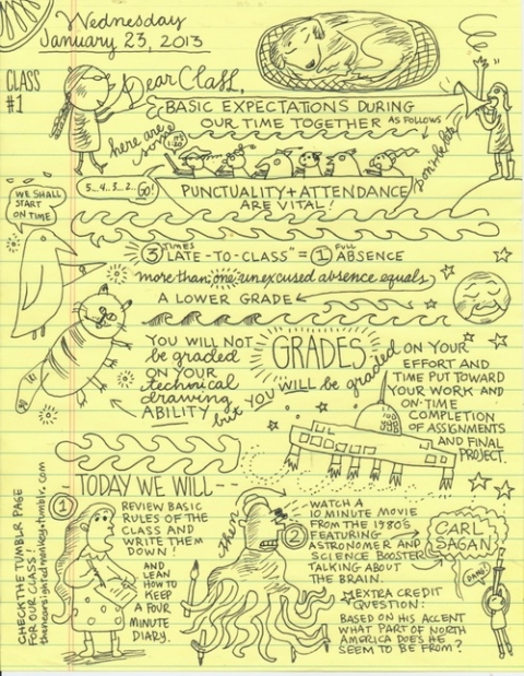
A writing and picture-making class with focus on the basic physical structure of the brain with emphasis on hemispheric differences and a particular sort of insight and creative concentration that seems to come about when we are using our hands (the original digital devices) —to help us figure out a problem.You can audit this course from home as Barry will be posting assignments to her Tumblr page.
Look at the first page of Barry's syllabus posted above, and other than drawings, how does it compare to the normal ten-page, single spaced, typewritten syllabus your professor usually hands out? Do you think pictures help students better understand what is expected of them? Would you like to get a syllabus like this?


this picture is so originality and interesting, and nice cartoon will reflect the painter's interesting thinking and idea. a lot of animal in the picture, reflect painter like animal most. each picture have one or two sentence to explain what he think about, totally this is a interesting picture.
ReplyDeleteHonestly, I like Barry’s syllabus better, compare with normal syllabus, it is easier to remember. Using a lot of funny pictures and a little bit words really interest me. Even though this kind of syllabus seems a little bit crowded, but if you look it carefully, you can find all the information arranged orderly. I think this syllabus is creative and funny, and makes students into it, moreover lets students want read every detail. As we all know, we can remember pictures easier than some long complicated sentences. So definitely, I want to get a syllabus like this.
ReplyDeletethis is a interesting syllabus, also this is a interesting drawings. this syllabus is very lively to show the lecture. This looks like the arts lecture, because the picture is very abstract. As a student, I am very like to see the teacher's syllabus like this. This give me a new view about the syllabus.
ReplyDeleteThe syllabus has about the same expectations about how the class should be taught and how students should be acting in class.I would say pictures would make a different in how students would go on about the class with pictures because with pictures they would see the expressions of how the professor personality is. I wouldn't mind getting a syllabus with pictures it would be different and i actually would enjoy it because it would show that the professor teacher is not that tense but is also following the rules and the expectations for the class.
ReplyDeleteThis class called the Unthinkable Mind, this syllabus reflect the teacher's mind.She want her student keep in mind. Maybe she likes think a lot which is previously unimagined.This syllabus was very interesting. Most of student will like it include the teacher and her class.Initiative is very important to study.
ReplyDeleteit's looks like very fun,this is a syllabus. it's can give student very deeply impression.i think this picture can help student better understand. reading the normal syllabus i think is very bored. i like get syllabus like this.
ReplyDeleteI prefer regular syllabus rather than this kind of syllabus. Because for the original syllabus is more specific and clear than this kind of syllabus. In my opinion, if I read this syllabus I will be confusing. However, it might be attract to kids such as in elementary school.
ReplyDeleteOverall, this is a very interest, and atractive syllabus with so many nice drawings and hand writing. However, this is not a good syllabus because there is a kind of mess of putting so many stuff in on page unorderly. Students may pay more attention on the drawing instead of the iformation there. Syllabus should be formal organized so that students won't be confused.
ReplyDeleteAt first sight, I did not even think it could be a syllabus. I prefer having a table or a regular syllabus which I can easily read or review. Barry's syllabus is too unstructured and disorganized for me to find the important informations I am generally looking for reading the syllabus. Usually, on a syllabus you do not want to loose time searching for informations but go directly to the point, which is impossible in this case. However, I find it really original and a much more pleasant way to work. Nevertheless, I think it is a question of character and that it suits Barry's artistic mind.
ReplyDeleteI think the fact that the author, Lynda Barry, went ahead to create a syllabus for her class that she will be teaching in the Spring of 2013 that was so "cartoonist" and fun to look over really did prove her point that her class wasn't actually about art or a lecture on "how to create a graphic novel" but that it focused on brain function. Maybe it actually showed off that people are more keen to read over and analyze drawings compared to just a whole bunch of words in a beefy paragraph. Overall i feel that the class would actually be easier for me with the type of syllabus that Barry had for her class. Compared to other syllabi that i have read from my other courses i like this one a lot better, its easier for me to read and the drawings are so well drawn in a way and that it makes me even more intrigued to read the syllabus than i actually should be. The pictures definitely help students to know what they are supposed to do in a class. I would definitely love a syllabus like this because obviously it wouldn't take me up to 12 times reading the damn paragraphs to understand whats expected of me.
ReplyDeleteWhen I first saw the picture drawing of the syllabus I thought it was a type of comic strip. As i read the writing between the drawings it was clear the content of the writing was all academic. The drawings served as an attention caller for me. I believe that for me as an individual a syllabus similar to this one would be fun at first, but in the long run I believe that important information will be over looked. The pictures are an attention caller, but can be distracting at the same time. Maybe it's because I have no experience with with this type of syllabus, but i prefer the written syllabus. In my opinion official documents such as a syllabus should be clear and professional.
ReplyDeleteAt first glimpse of this syllabus, it already lured me into to wondering what it was until I had read the passage regarding the drawn pictures. If syllabuses were drawn out and written with minimal sentences of what the course expects just like Barry's, it would most likely grab the students' attention rather than a 10 page, single-spaced syllabus that explains every little detail of what is to be expected of the course, which we pretty much see every new quarter. However, not all teachers/professors are artistic and take the time to draw out the syllabus, but it would be a fun interaction on the first day of class for the professor and students.
ReplyDeleteI skimmed the picture, I didn't really read what was on it until the instructions told me to scroll up and pay attention to it more. When I did really look at the pictures and words, it was almost like a syllabus but in a fun and 'cartooney' kind of way. Instead of having long boring sentences on the syllabus, it had fun drawings that explain what is expected for the classes. Instead of me re-reading the paragraph a few times, I can understand what the professor is saying in the cartoon syllabus. Despite being not professional, it caught my attention as the professor being fun then being boring in the syllabus.
ReplyDeleteThis syllabus is interesting. I think if teachers would take the time out to be creative with their syllabus students would gravitate towards the course. I like how the artist combines art with writing.The technique showing students that everybody's brain interprets things differently. For example, my first thought of this syllabus was the impression of a child's dream. Pictures take the students mind on a journey, from beginning to end, easier to remember of whats expected from them.
ReplyDeleteI think this syllabus is easy to keep in mind without memorizing it. Because once you see this cartoon with the syllabus, it will stuck in the mind. And it does not require to read again to understand. This class is not about art, but this syllabus shows how brain functions and this syllabus is abstract. But I think this syllabus is not detailed. So I would not prefer this syllabus in advanced class but I liked the idea Lynda Barry chose to make it interesting and fun. It is really interesting to know how our brain functions.
ReplyDeleteLooking at the first page of Barry's syllabus posted above and his drawings it doesn't compare nothing to a normal ten- page single spaced, typewritten syllabus my professor usually hands out it looks very different . When my professor hand out the syllabus it does't have any picture. I wouldn't like to get a syllabus with picture I like way better my professor syllabus because it's way more clearly to understand. In addition, it depends on a person some people would like to have a syllabus with pictures and so people wouldn't like Barry's syllabus. I wouldn't like to have a syllabus like Barry's because it doesn't look organize.
ReplyDeleteThis picture is interesting. At the first time, I didn't realize that the picture is a syllabus. Syllabus in my mind is used to be a formal document. This picture syllabus might be harder to understand for people other than the author, but it really can let readers have a smile on their face when reading this, which is what a "normal" syllabus lacks.
ReplyDeleteJudging from the first page of Barry's syllabus which is more than an ordinary, boring syllabus the rest of it will be very exciting. With many visual aspects of the syllabus which relates to the course he is teaching because it causes us to use different parts of the brain than we would use to simply read a one spaced, 10 page regular syllabus. For visual learners like myself, it makes it easier for us to understand and remember what is expected from us in the course. I would prefer to receive a syllabus like this.
ReplyDeleteThe pictures would capture the attention of the students because no teacher has ever decided to draw pictures or illustrations on their syllabus, students would think the teacher is creative. Syllabus that consist of 10 pages, informing students of the same information other teachers provide tend to get boring, these images would spicen up any teachers syllabus as long as its easy to understand and is relative to the course work. i would expect to see one of these in an art classroom or in the hands of a "young teacher". i would love to receive a syllabus with images..
ReplyDeleteLinda Barry's first page of her syllabus is very bizarre. When I first looked at it, I thought it was a student's notes with drawings on them. I never thought it would be a teacher's syllabus. Her syllabus is completely different from the syllabuses I have been given. Barry's syllabus has a lot of hand drawn pictures and brief sentences. It's all over the page. It is confusing to read at first, but it brings "life" to the class. I think Linda Barry did this so that she can show her students that her class is going to be a fun learning experience. To some students, I think pictures help students better understand what is expected of them, and others not. For me, I think pictures would not help me better understand what is expected from me. If I were given a normal syllabus telling me what is expected from me, I would understand it better than the pictures. A syllabus is very self-explanatory. I would have a better understanding with pictures if it was used to explain something I don't understand. I would like to get a syllabus like Linda Barry's, but at the same time I would not. It's cool to have a teacher have their syllabus like that, but then I would think the teacher would just be playing games and jokes all the time. I would not take the class seriously.
ReplyDeleteBarry’s syllabus is very intriguing; unlike normal typed syllabi this drawn one grabs my attention and makes me want to read it. This syllabus is fun but still gives all the important information needed. I am a very visual learner so not only do the pictures grab my attention but they help me remember what is written on the syllabus. I would enjoy getting syllabi like this one more often than a typed boring one because it makes the class seem more exciting and I may have a better outlook on the class. Also I would enjoy a syllabus like this because I would actually want to read it. I think more teachers should make their syllabi like this.
ReplyDeleteThis syllabus is more interesting than what teachers give students. Visually it is fun to look at and easy to understand.I do think that pictures help students understand concepts better than words because we are used to seeing images on TV and comprehend them in a different way. I would like to get a syllabus like this, it makes it easy to read over again, it is simple and to the point.
ReplyDeleteLynda Barry's work is remarkable. Since we usually have only writing syllabus in class, this one makes me curious. First,the word "grade" in the middle of syllabus points out how the score will be graded. Second,the long boat emphasizes how punctuality and attendance are important in this class.Barry creates the formula ; three late class equals to one absence which is simpler and more understandable. Finally, there are two objects in the bottom part which separate the space and help the readers get more clear idea about what they will do today. those two figure do like a fame in comic books.
ReplyDeleteThis syllabus is one that caught my eye immediately. I do think that most students will learn better by seeing images and a picture rather than a bunch of words strung together. Don't get me wrong, I love words and reading is great, but if the point is to remeber the information it is better to learn it by seeing it drawn out. This syllabus is a great example of that. Not only is an image easier to learn and remember, it is also fun! There is no rule that learning can't be fun. When there are fun aspects included in a lecture or class, I tend to remember more. Teachers that include a litle pizzazz in thier lectures seem to be more fun and the lecture becomes more intriguing. (Which makes me want to learn more and pay attention.) Many teachers are afraid to go about teaching in a fun and unique way, thats why when you get one for a class, they are one you will never forget. Not only will you remember the teacher or professor, but the information and study skills taught as well. Going back to the syllabus, I would LOVE to get one like this one. It portrays what the teacher is trying to get across to the students and at the same time it's fun!
ReplyDeleteBarry's syllabus is very unique and interesting. The important thing like "GRADE" is put in the middle of it and catches our eye. Syllabus is usually written formal but this imformal format with animals gives us ideas like welcoming atomosphere and interesting class. Handwriting gives nice and comfortable impact.
ReplyDeleteIn this picture we can see what people who is not very familiar with reading prefers, icons that make your reading more interesting, i belive that it is a good idea to represent certain things we try to say with drawings, like that cat that you show that represents ability, it not only makes it more interesting to read, it also gives some humor to it, this type of details attracts people to read.
ReplyDeleteThis syllabus is very interesting, in my mind, syllabus is all old textbook like boring papers. But this one is different, it fun, it looks like a comic, if I got a syllabus like it, I will remember every details in this syllabus, just because it's too fun to read. However, I don't think it's a good syllabus, is not very practical, it was definitely fun to read with but it just like the flower in our bedroom, beautiful but useless.
ReplyDeleteThis syllabus is by far the most entertaining and engaging syllabus I have personally seen and read. With most students this generation we are more of a visual learner rather than text. Most of us are unable to hold a focus while we read anymore unless you read oftenly. But if instructors are able to embedd visual writing onto the syllabus then students would be more engaged and more likely to grasp what the instructor is enforcing for class standards.
ReplyDeleteThis syllabus caught my attention immediately. It was the complete opposite of a syllabus that you would normally get from your professor. I realized that if mroe professors were to give out syllabuses like this then they would be able to be more interested in the class that they are about to take. Since the syllabus catches your attention so quickly, it pulls you in and actaully makes you want to read it and look into it. Rather than your typical syllabus that you just overlook and only look at when trying to figure out important due dates and things that wont take you long to read but are important for you to know. I personally wouldnt want to recieve a syllabus like this because I wouldnt be able to understand it like I would want to. I think that it would throw me off because id rather see my assignments and due dates in bold rather than in drawings that I would have to really observe to find.
ReplyDeleteReading syllabus it has been a problem to all students in general, i include myself in there, but this particular syllabus has capt my attention. Creating a syllabus in a entertaining way is a smart way to grab students attention. Presenting in a funny way changes the steriotype of old fashion and boring sillabus.
ReplyDeleteThis syllabus is actually pretty interesting. I usually never enjoy reading them but this one I actually wanted to read. Since this syllabus is interesting more students are likely to actually read it, instead of put it in the darkest parts of our binders reading it when only necessary.
ReplyDeleteThis syllabus does not compare to the normal white printer paper typed syllabus. The words are in different fonts and also different sizes. They also vary in shape and direction/position they are on the page. He did not even type this syllabus nor write it on the usually plain white printer paper. It really pops are first glace. Syllabuses never usually have pictures on them, they are are only used to give information. This syllabus has random pictures all over the place. It has no format whatsoever. I believe this type of syllabus will get students' attention better than a plain typed syllabus. Some student do not even look at their syllabus, this type a syllabus, every student will want to look at even if they are not in the class. This is really a treat for the eye and I would love to receive a syllabus like this one. Judging from the syllabus, it also give the students an idea of what type of professor teaches this class and from the looks of it, I already like this professor.
ReplyDeleteI agree with you that this kind of syllabus would get students attention and they would look on the syllabus more frequently compare to the professional syllabus style. Since this syllabus is with different kind of weird drawings on it which makes it look interesting. I believe that pictures help students better understand what is expected from them, but I am not sure if this kind of syllabus would be allowed to use in academic places. However, I would like to get a syllabus like this. Usually I do not look at syllabus frequently which is not a good practice but the syllabus with drawings might help to get rid of that.
DeleteFrom looking at the syllabus above, I don't think that it could be one bit compared to the ten page, single-spaced, typed syllabus. I personally think that this syllabus is a bit more confusing than the regular syllabus. I don't think that it would very comprehendible to students because it is not really structured and the requirements for the course are all over the place. In this case, I don't think that pictures would do students any justice when it comes to understanding what is actually required of them. For me personally, I would not like to get s syllabus like this. I'd rather have the ten page thesis type written because it is more detailed, specific and structured. This syllabus is just kind of over the place to me. Everyone is different though, so some people might like this style better.
ReplyDeleteI've never seen a syllabus like this, ever. It's eye-catching and fun to look at all the little details. I don't think you can really compare this to the normal ten page, typed syllabus. Both have somewhat the same information except Barry's is way more reduced. I think some people would appreciate this type of syllabus more and others wouldn't. I'm on the fence for this, I like the idea of it but I sort of prefer the normal syllabus. It's more professional and straight to the point. The drawings are amazing and this syllabus is really creative but I just want a syllabus that I won't get distracted from reading from with all the drawings next to it.
ReplyDeleteThis syllabus is confusing and not what i am use to. The basic information in the syllabus is scrambled up in different areas of the paper. Also, it only has doodle drawings on the paper, and some of the drawings do not have any meaning or relate to the syllabus. I think it is best to use the old syllabus that does not have the information all jumbled up.
ReplyDeleteI really likeBarry's syllabus, because if I show this kind of syllabus on first day of this class, I will think this class and this teacher must be very fun. Because I have never seen this kind of funney picture syllabus before. All our professor's syllabus look like same, no pictures, boring, black and white.From the syllabus we will think this class maybe boring. However if we got this kind picture funney syllabus, I will think this class seems interesting and this teacher must be very kind and funney.And it is much fun to read than the normal syllabus, usually the normal syllabus just will make us very sleepy. So me and I think most student will love this kind of picture syllabus. And I hope maybe one day I will get one from my professor.
ReplyDeleteAt first, when I look at Barry's syllabus I think "wow! this is very interesting and creative". But then I really look at the syllabus and its everywhere. The syllabus is jumbled all together into a pile of nonsense. I personally just want to find the important things in my syllabus, highlight them and reference them later. I do believe that pictures say a thousand words and they help visual learners understand what is asked of them. So, I would not like a syllabus like this, it is too disorganized. I do give Barry credit for creativity and think this is suited better for children in elementary school.
ReplyDeleteBarry's intake in a syllabus is very interesting. If the title of this blog did not mention the word "syllabus," I would have never guessed that picture was a syllabus. Barry's syllabus is far from different that your average syllabus. Instead of your average ten page, his has illustrations of animals and people. The syllabus captures your attention, however I think it is hard to understand because pictures are in between the words. Also you can not tell what order the words go. I do believe pictures help students understand the materials better, however I think the pictures have to be relatable to the topic. For instance, Barry's syllabus contains pictures, however they are not relatable to the syllabus. He has pictures of mystical creatures. As much as this syllabus looked appealing, I would prefer to have the original type of syllabus because it is organized and easier to follow.
ReplyDeleteWhen I see the blog, I was attracted by the diagram. Firstly, I think this is a cartoon comic. After I read it, I realize that this is a syllabus. I like the way how the syllabus shows the information. However, if we have too much information to show, we will never be tired to get the information from syllabus. Also I like the author mentioned about the training of create mind. I take one class about creation, imagination and invention this semester. I realize that the significance to train my hand follow my mind. I think the best way to train is to take quiz follow the method. We can draw the diagram when we want to represent ideas. However, the difficult part is that some student do not have the skill to drawing impressively. So it is hard to be understand clearly clearly.
ReplyDeleteI believe that a syllabus like this introduces the class to students a little lighter. The drawings and humor can make students more relaxed, while the text provides what the teacher still expects from students. When compared to a normal syllabus, it is a change in style. When i receive a 10 page syllabus, my initial thought is how much work has to be done within the semester and that the teacher expects a lot from students. I would like a syllabus like this because it is short, simple, and to the point.
ReplyDeleteI like artistic creative expression but this is too much. It makes me question the teachers professionalism. Theres plenty of opportunities to be creative as a teacher, I don't think a course syllabus is an appropriate place. If this is the main syllabus it doesn't have enough information. If this a daily syllabus I would recommend teachers spend more time working with students instead of drawing them cute pictures. It has a 5 second wow factor that quickly fades to confusion. Iv'e never seen a syllabus for one day, but in my experience the more organized the more useful. We don't care about academic goals and plagiarism, you read one syllabus you've read them all in these regards. Just give us the dates, grading scales and assignments, hold the carpel tunnel.
ReplyDeleteThis by far the best syllabus I have seen since I started college. Most syllabus are plain and just go on and on forever. They usually take a whole class just to go over it. Its interesting how she is trying to appeal to other majors by doing this. It seems like a good idea because I feel more people would want to take this class because it seems interesting by the syllabus alone. Barry seems like a different kind of professor because not is her syllabus completely different then any other teacher but she post her assignment on tumblr. I think this is a good idea because it makes her more connected with her students since she is using a social network that many students use such as tumblr. I would be very interested to see what kind of assignments she assigns to her class.
ReplyDeleteBarry's syllabus is completely different from what college students are use to, of course because of the drawing and and the text that's its written in. It makes the class seem more fun and exciting and not as hard as it may be. I am not exactly sure if she will give the class a syllabus because she said that the class was going to write down the rules of the class. On the one page syllabus that is presented it only talks about attendance, what they are going to do in class today, and Barry lightly touched base on what the students will be graded on. Unlike a regular syllabus there was no break down or in depth description of exactly whats going to be going on like when the first project or midterm is due. Barry's syllabus is good to look at but when I need help clarifying anything I would always return to the good old trusty normal ten-page, single spaced, typewritten syllabus my professor usually hands out.
ReplyDeleteCan our Syllabus be like this! So cool and creative, it makes the teacher seem more approachable and interesting. I don't think that it determines the overall effectiveness of the syllabus but it's definitely a great way to get students engaged and interested in the course. The drawings are really neat, and you have to pay close attention to make sure you read all of the messages without skipping any- a cool idea for a class on brain functioning. I love when teachers think outside the box, and make an effort to make a personal connection with their students. Stand-offish teachers make it really hard to sit through a long class, especially one about science! More drawings please :)
ReplyDeleteI found this syllabus very interesting. A syllabus with visuals is a unique approach to presenting the coursework to the students. I personally believe Barry's syllabus is more interesting to look at than a 10 page all word syllabus.To me, a syllabus is sort of like the first impression a professor makes towards their students. If students were to receive a syllabus like Barry's, she would definitely make a good first impression.However, I feel that the syllabus is a bit confusing to look at it. It may take a while to completely understand what is being asked because everything is all over the place. Although a 10 paged syllabus full of words is boring to look at, it is properly organized.I personally would love to be given a syllabus like this. I enjoy looking at drawings and I feel like I comprehend better with visuals.
ReplyDeleteI found this syllabus pretty unusual. I really like it! because in some way the syllabus is the first face that a student received for the class. Use kind of cartoons is going to call more the attention of the student, although I believe that with this one is really necessary a schedule of all the activities. Sometimes innovating the people is the best way to get their attention and that is the goal of every single teacher. So if Linda Barry can support this creativity through the class and with her personality, is not going just to keep the majority of her students but also is going to make easier learning the class.
ReplyDeleteOne word to sum up this syllabus; AWESOME. Like 99.9% of the student population, i hate sitting and staring at a 1000 page syllabus that we have been over a million times. It has been drilled on our brains since the beginning of time and its utterly boring. The idea to incorporate visuals that intice the brain is an excellent idea. The students will be more interested and might pay a little more attention knowing that the instructor isn't a total bore fest. I end up doodling on every page of the syllabus anyway, might as well beat me to the punch.
ReplyDeleteI would actually listen to the professor explain the syllabus if it looked like that. That is for sure the coolest syllabus anyone will see. I like how she used visuals to grasp the attention of the students but also includes words to make things clear. I have never had a syllabus like this in any of my classes. The usual syllabus is a few pages of black ink stating the required books, what to expect, grading, and how the professor will drop you if you miss more than four classes. I think the pictures definitely help students better understand what to expect in that course plus there is text with the pictures.
ReplyDeleteI think it is a great idea to make a syllabus like a drawing. It is unusual to have such a unique syllabus, which to some extent means that this class might give you an unexpected experience. Even though this page of syllabus is full of drawing, it is also very informative. It includes everything that students need to know, for instance, attendance requirement, today’s class schedule. Comparing to the normal ten-page, typewritten syllabus, this type of syllabus is more inspiring and interesting that motivates students to learn. Usually, the traditional type of syllabus is too long that students would not like to look through, though it is more straight and clearer. Also, the pictures help students understand better about the expectation from the teacher and the class. By looking at those pictures, students will visualize their coming learning experience with this teacher and class, which is a good way to motivate students to study harder. I’d like to have such syllabus, especially for my science classes. It will be an interesting experience to read class requirements and schedule in such vivid and funny form.
ReplyDeleteCompared to normal syllabi, this syllabus is a little harder to read. You have to do more searching on the paper to find the information. Also, all of the information is surrounded by drawings, so it looks a lot like that page in most peoples' notebooks that has been designated for doodles. I think it draws the interest of the students more than a traditional syllabus. Personally, when I am handed a syllabus on the first day of class, I usually just stuff it in my binder and tune out as the professor reviews it. Most syllabi are the same general thing so I just quickly scan for the important information like any special rules or a class schedule. If I was handed a syllabus like this, I would definitely be eager to inspect every inch of the pages and read all of the details. I think a syllabus like this is much more effective in catching students' attention and therefore getting them to pay attention to the actual information you are trying to get across. As a future teacher, making this kind of syllabus may be something that I look into.
ReplyDeleteIn comparison with your everyday syllabus that a professor at a University would distribute, Lynda Barry's version is quite entertaining. It points out key points and does in fact inform of the expectations of the class. "Punctuality + Attendance are vital". Although a 10 page syllabus is long and mundane, it can more thoroughly convey vital information needed to the students to do well in the class. It can contain dates, rules, policies, and so much more that this page full of drawings and words cannot. Although I personally would not like a syllabus that looks like the one pictured above, I would like to see visuals on a regular one to somewhat spice it up. Reading the same old 10 pages for every class can get boring so I would not mind. Visuals always help students better understand material and I can attest to this. Overall, fun and interesting syllabus but not useful to convey well needed information for students.
ReplyDeleteI personally do not really like the picture syllabus and I'm not sure how I would feel if I got one. Although it is very nice and well detailed, it would be hard to refer back to during the semester. The drawings included can make things fun and interesting, but I believe that they would just distract me from what I really would need to know. I usually check the syllabus everyday before I come to class to make sure I have everything, but I feel like it would be more difficult to refer back to this syllabus. Just reading Barry's syllabus now, I am having trouble being able to read a straight sentence and it took more longer than it usually would just to find out what the teacher thought about absences.
ReplyDeleteSyllabus like this is really interesting and attracting the students to read and know what the topics are from the syllabus. Although there isn’t much organization from one topic to another, Lynda Barry’s syllabus is brief and easy to understand. With the pictures on each topic, students will remember that the attendance information is written on the boat. For me, I am more of a visual learner. I learn more when there are graphics, pictures and physical in-class lectures. I can imagine more on what I need to learn and it makes me remember the pictures of that certain topic. Of course, not all students are like me. Some are more into the old-fashioned syllabus that we get today and some may prefer this kind of syllabus. In my opinion, professors should just stay with the simple typed syllabus for uniformity and formality. At the same time, not all professors have the creativity and time to do this kind of syllabus so it is okay to have the syllabus that they hand-out today. I would like to received syllabus like this but I am not expecting to get one at the same time.
ReplyDeleteFor some instances I think pictures actually help students retain information. For example, whenever there are pictures in my professor's PowerPoint, I tend to retain the information that is being explained. However, with the syllabus that was drawn, it really was just a visual mess. With serious issues like "when is the final exam?" and "how many classes we need to show up before getting our grade docked?" no syllabus should passed out to students like that. Usually I am all for creative ways to get a point across, but Lynda Berry's syllabus was just a big clutter and I would definitely prefer a normal syllabus than an over the top one.
ReplyDeleteThis syllabus is very different from the average syllabus that one receives from their professor. Most syllabus packets are written very formally and are worded like legally binding documents. The pictures on this syllabus really stand out because they are completely absurd but that makes them memorable. The text written next to the pictures is also short and sweet. When a student reads a syllabus it is easy for them just to read what is in bold text or in bullet points. The text that is next to the pictures highlights the important parts of a regular syllabus and makes those points memorable by putting them next to a memorable drawing. I would definitely like to get a syllabus like this because I wouldn't have to read through ten pages of information just to find out what is expected of me in the class which can easily be summarized in a few sentences. The only addition that would be necessary to a syllabus like this would be a calendar of due dates for assignments.
ReplyDeleteLooking at the syllabus you would not expect it to be your typical syllabus rather a doodle or sketch. But besides the drawings, the content in the syllabus are everything you would find on any normal syllabus. It includes the essential information like what is to be expected of you in class, attendance, grades and the daily agenda. Looking at a syllabus filled with information is quite overwhelming for many students especially on the first day. Rather than giving out a wordy syllabus, I think a lot of students would prefer this drawing version much better since it’s interactive and straight forward. Instead of having to stress about all the information given on the syllabus they can look at the drawing as a form of art. Personally I’m a visually learner, so if was handed this type of syllabus over the normal syllabus I would be ecstatic.
ReplyDeleteEXTRA CREDIT:
ReplyDeleteAfter reading this syllabus, I enjoyed learning that this type of syllabus even exist. Being in school everyday for the last 16 years gets boring, old, and repetitive. Every syllabus begins to look the same, and half the time students don't even read them because they know what to expect. This syllabus shows diversity and gives the visual learners a cool way of learning new things.
The way that this syllabus is structured makes the class look more appealing than a stack of papers with many complicated words. Pictures help students with learning because it allows them to interpret better and the minimum amount of words get to the point right away, rather than spending a lot of time reading an entire paragraph just to find out that there is no extra credit in the class. It would be nice to get a syllabus like this every once in a while because then you ease to the class a little better since you would feel welcomed with a drawn out syllabus.
ReplyDelete